Data Visualisation

Charts, dashboards and infographics that make complex data clear at a glance.

A good analysis never reaches the decision table if it is not understood. In data visualisation, our aim is not to decorate the numbers but to tell the right story to the right reader in the simplest way.

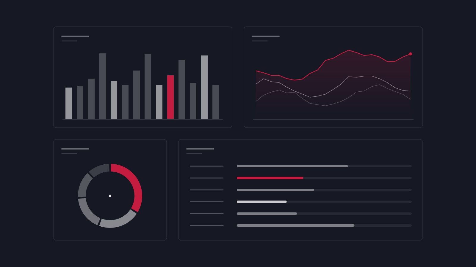
We work across formats: charts for reports and presentations, interactive dashboards that are updated regularly, infographics for the public and data stories published on the web. We build the process together, from preparing the data to design and publication.

Questions it answers

  • How can we make the results we present to management easier to understand?
  • How can we track our indicators regularly from a single screen?
  • How can we share our research findings with the public?
  • Why are our reports not being read enough?

Methods

  • Interactive dashboards
  • Report and presentation graphics
  • Infographic design
  • Web-based data stories

Deliverables

  • Interactive dashboard
  • Chart set
  • Infographics
  • User and update guide

Typical duration 2–4 weeks


← All services

Have a question?

If you have a question in mind, let’s shape it together. We’ll think through the rest with you.